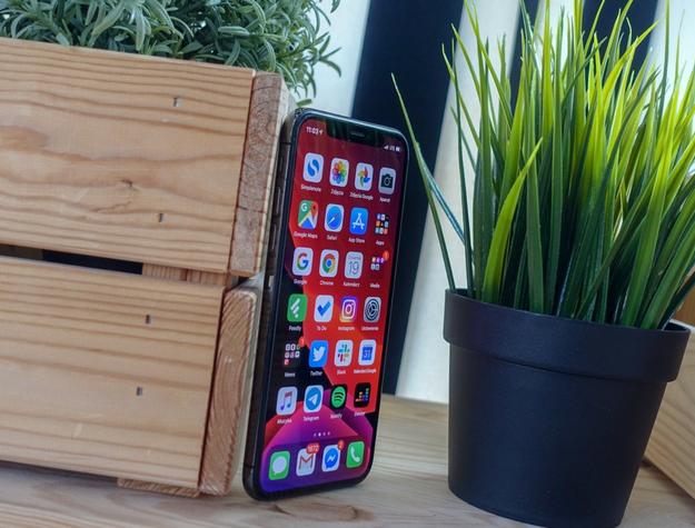
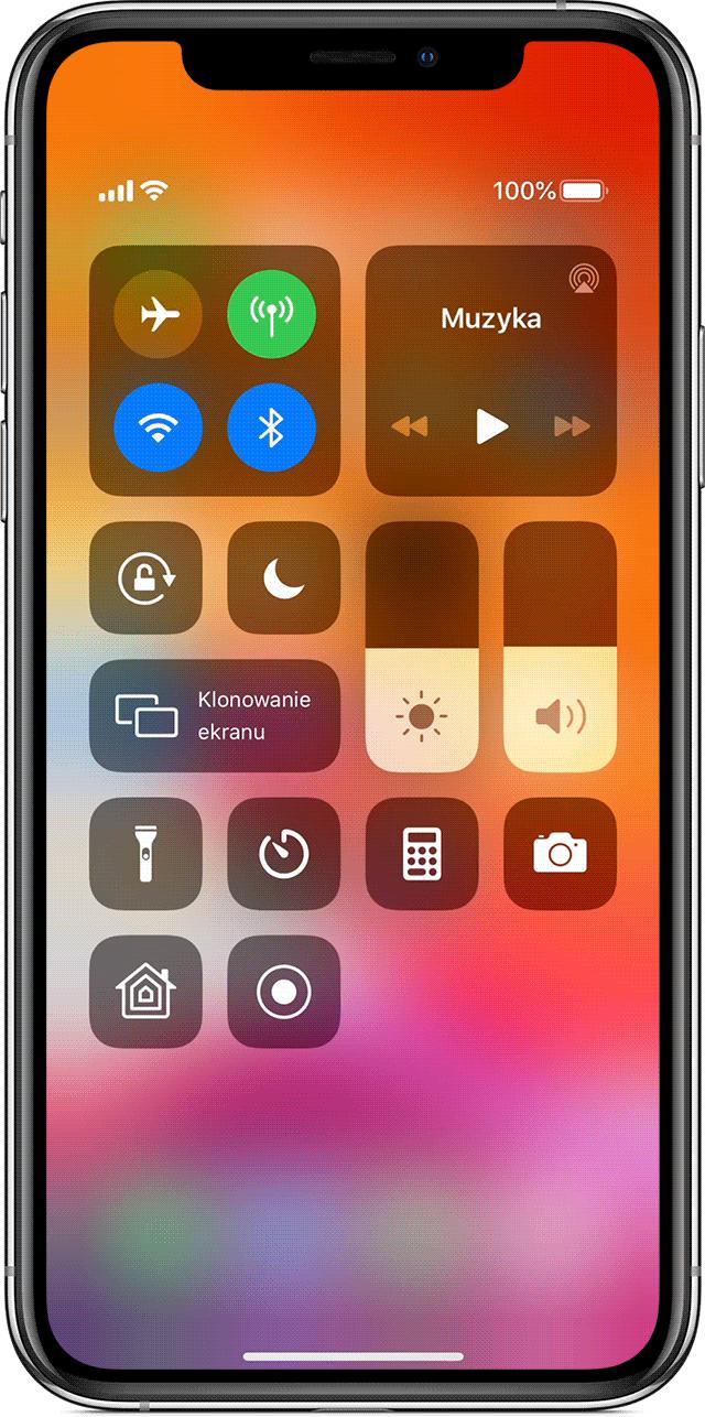
The list of changes and news in iOS 13, as with any other new version of the system, is very extensive and detailed. We could start listing all the little things, even the little things you won't even pay attention to, if we didn't mention them, but it doesn't matter. All that matters is what will actually (positively) affect the way you use the iPhone and in the end iOS 13 comes out of this clash unscathed. This was due to three issues: the new look of the system, new versions of the application and the work under the hood, which deserves high praise.
This will interest you Mac screenshot - how to? (tutorial) My first iPad - 7 things you need to knowiOS finally changes its look. Almost
I could not help but start with the news, at which some people will wave their hands, and the other group will be delighted with its appearance. Of course, I'm talking about a dark theme, and I must admit at the outset that I belong to the latter group. The dark background in Messages, Calendar, Settings, Notes or E-mail is a salvation that I have been waiting for a long time, as soon as there are mentions that it can appear in one of the smaller updates in iOS 12.x.
The dark theme in iOS 13 is a rest for the eyes and the battery. However, it did not happen and the dark mode is one of the biggest news of iOS 13. In places it is just like the inversion of colors, in other circumstances you can see that Apple has rethought its appearance. In the end, I use it not only in the evenings, but also during the day, saving my eyes and energy in my iPhone (only models with OLED screens). After the update, you will also notice that the system font has changed, which is softer and more elegant. I got used to it quickly, I really like it.You will surely like the new applications
According to tradition, the new iOS brings changes to many system applications. This time, the biggest reorganization has been for Reminders, Photos, and the smaller improvements have been made to Notes, Maps and Messages.
Unfortunately, I don't quite like what happened to the Photos app. It's true that the previous version of iOS 12 needed an update, but not all changes went in the right direction this time around. Mainly because Apple is increasingly focusing on algorithms and synchronization of our local photo collection with iCloud, and if we are not interested in any of these features, then we will have a bit of a hill. In terms of the interface, everything looks nicer, it is more pleasing to the eye, but automatic albums (everything happens thanks to AI locally on the phone, without exchanging data with the cloud) do not always choose the right photos, places and faces, so I would prefer to have an easy way to edit selected photography. The "For You" section can surprise you by choosing photos that we have forgotten, but that would be it.
Read on belowMuch more important changes have been made to the photo editor, the operation of which is very simple and quick beautification of photos is finally possible. Below the picture you will find a horizontal tool list (the first is autocorrect, be careful) then go to the slider below and adjust the level of brightness, exposure, contrast and so on. At the very bottom, there are tabs leading to filters and the trimming function. You get the skill very quickly and without downloading an additional application you can improve the photos you just took. There are also new products, such as tilt adjustment (vertical, horizontal), vertical rotation (goodbye mirror selfie!), Or changing the aspect ratio. I will still come back to Snapseed, but less demanding users will be satisfied.
Brand new Reminders

Reminders have been completely rebuilt, and instead of a stack of cards, we now have a typical list, above which there are some useful shortcuts to categorize our reminders. Your attention may be drawn to the Convert button, which will replace the old type of Reminders with the new one in iCloud, but also warn you on which devices they will not offer new features (these are devices without updating to iOS 13 and macOS Catalina). In fact, everything would be more convenient to use than the older Reminders, so it's hard for me to write anything bad about the new version of the app.
Adding details such as the time and / or place of the reminder, flagging and attaching photos is now much faster thanks to the icons located just above the keyboard. Changing the order is extremely comfortable, because grabbing the list with one finger and scrolling the content of the application with the other means that I cannot imagine returning to the earlier waiting for the content to scroll when we held a given item at the top or bottom of the screen. I wish it would work in other applications, including third-party applications, but I guess I'll have to wait a little longer for it.
Notes allow you to add various types of attachments and handwritten notes (even with your finger), Maps have something like Street View, but forget about the usefulness of this solution in Poland, so focus on creating lists of locations that you can share with others. The iMessage system allows you to enter your own contact name and avatar, which will be displayed to other users using blue bubbles. The ability to use Memoji in e-mail and other applications from the system keyboard I would prefer to remain silent, but this is a good opportunity to show how Apple cares about being cool, so let me mention: you can do it now.
Due to the lack of a Polish dictionary in the system keyboard, if we want to use swipe gestures to enter text, we are still forced to reach for Gboard, Swift or another keyboard from the App Store. Fortunately, we are not spared the introduction of a new section with games for the Apple Arcade subscription to the App Store - I am in the process of testing the service and I will only say that this is probably the only thing that could encourage me to return to mobile gaming. Unfortunately, the appearance of this category in the App Store makes the list of installed applications a bit more difficult to access. As a sweetness, we got the option to remove the application from this list in the App Store application, for example, before we fully download it or update it.
Is that all there is? iOS 13 is just that, or so much
And that was it? So why such a big fuss about iOS 13? - you will ask. Finally, the icing on the cake, which I put to the top when assessing the beta version of iOS 13.1, i.e. the unfinished version of the system. It is telling that even in this release, which did not run out of mishaps, iOS on the two-year-old iPhone X managed to speed up. It is visible while unlocking the device with Face ID, launching the application and taking photos. Other models, such as the iPhone 7 or iPhone 8, will also behave in a similar way, so if you own them, having no other arguments for the update, this one should be enough. Let me remind you that with the introduction of iOS 13, Apple is abandoning nearly six-year-old devices such as the iPhone 6 or iPad Air, which should not surprise anyone.
The menu has also changed its appearance 3D Touch Haptic touch. On newer models (Xr, 11, 11 Pro and 11 Pro Max), where 3D Touch is missing, a longer hold is enough, but luckily iOS 13 does not turn off 3D Touch in previous iPhones, so you can use it. The problem is that, for example, on the iPhone X, both functions are active by default, so a longer hold on the icon on the home screen will first display a context menu for you, and then enter the icon management mode. Apple clearly wants to discourage users from 3D Touch after it has abandoned it.
Even though after so many years we managed to fix the ringer / media volume indicator (finally, goddamn it!), Which no longer covers the center of the screen, incoming calls still cover the entire screen, instead of appearing in the form of some sort of notification at the top of the screen. And that's what I meant when I wrote about mindlessness, because it seems no one at Apple is using an iPhone for phone calls, since no one is bothered by a full-screen incoming call notification from interrupting work or entertainment.
But you can get used to it already with Apple. There is nothing else than to wait for iOS 14. Or iOS 15. Or 16.
You know what I mean.
iOS 13 will be available for download today on the following devices:
iPad OS (iOS 13 for iPad) we will devote a separate material.


![Apps and games on iOS for free.Promotions, discounts, discounts [27.12.2021] Apps and games on iOS for free.Promotions, discounts, discounts [27.12.2021]](https://website-google-hk.oss-cn-hongkong.aliyuncs.com/article-website/google/2021/12/31/661e1a9d1bdfffaecac65b0350aa0db5.webp?x-oss-process=image/auto-orient,1/quality,q_70/format,jpeg)