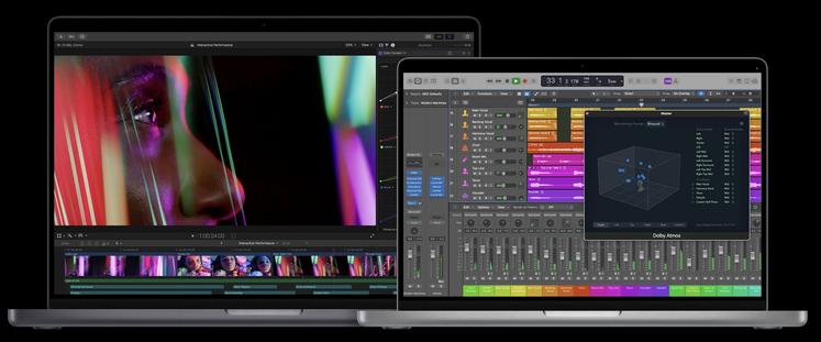
MacBook Pro 2021 promises to be a great piece of equipment, but if the story goes full circle and the competition follows Apple again, we're going to have a small rash of nightmares.
Let's face it, today's Apple may not be the king of innovation, but it perfectly finds itself in the role of popularizer of new ideas. This was the case, e.g. with an indentation in the screen of the iPhone X or recently with magnetic accessories. Nothing groundbreaking about it, but once they had the courage in Cupertino, the rest followed suit.
You know what I drink to, right? Of course, to the notch in the screen of the new MacBook Pros. However, I do not want to get into a discussion whether it's cool or not, because opinions will probably be divided. I mean something else.
Dear producers, don't go down this path
Not this time. I realize that Apple's solutions are eagerly picked up by others. The American manufacturer, more or less rightly, has earned the status of a cult brand, which is why its designs are often perceived as a determinant of the prevailing trends that set the rhythm of the consumer electronics industry.
However, while I don't really mind reproducibility, even if it's to the measure of Xiaomi Mi 8 and the aforementioned iPhone X, thoughtlessness does. I translate.

The screen of the new MacBook Pros is not the typical 16:10 aspect ratio, but 14:9. Consequently, it is effectively higher, thanks to which the island can be integrated into the system toolbar, otherwise located in macOS at the top of the screen, and without disturbing the main workspace. And keeping a hand on the operating system, Apple has virtually unlimited scope.
Anyway, he expresses it in his promotional materials. Pay attention to how applications are presented on the screens of the new MBP. You won't see any stains on the picture. The system toolbar disappears. Excess pixels are blanked out.
I am convinced that at any moment there will be people who will admire the unconventional design of MacBook Pro A.D. 2021 they decide to realize in a classic laptop. I mean under Windows. God forbid, plus 16:9 or 16:10.
See: Apple MacBook Pro 2021 - Polish prices. take a deep breath
We've done this before
Hands up who remembers the first Android notch. Unfortunately, I remember. I had the dubious pleasure of using Honora Play with Android 8 on board, which after opening the on-screen keyboard got stupid. The application window tilted up in such a way that the infamous indentation covered the text. Super comfort, doggy.
It was only Google that came to the rescue, and more specifically Android 9, in which the indentation support has already been civilized. Smartphone manufacturers were, to put it mildly, reluctant.
Another thing is that eventually fashion died anyway. Apple stayed true to its own, but the rest jumped towards tiny tears or O-shaped holes. Only, no wonder, since the notch in the little robot is still associated with makeshift. By the way, this is probably also a problem of the islands as such, but let's get back to the merits.
Microsoft is unlikely to be as philanthropic as Google. Not when he has just released the revolutionary Windows 11 and is pushing his ideas hard, such as convertible Surfaces. Playing with indentations would be a formal slap on the mat. That competition dictates the rules of the game.
The more you can feel the coming tinkering here for a kilometer, and I sincerely appeal to you, laptop manufacturers: don't get crazy and skip the follow-ups this time. If I had over 10,000 zlotys to throw away, it is possible that I would give the new MBP a chance. Nevertheless, I don't want to wake up to a world where every budget notebook scares me with a knitted indentation.
Do you want to be up to date? Follow us on Google NewsImage credit: Press materials
Text source: Apple, comp. own
Tags:apple macbook pro 2021macbook pro 2021 notchmacbook pro 2021 reviews

![Apps and games on iOS for free.Promotions, discounts, discounts [27.12.2021] Apps and games on iOS for free.Promotions, discounts, discounts [27.12.2021]](https://website-google-hk.oss-cn-hongkong.aliyuncs.com/article-website/google/2021/12/31/661e1a9d1bdfffaecac65b0350aa0db5.webp?x-oss-process=image/auto-orient,1/quality,q_70/format,jpeg)