- SPIDER'S WEB
- Technologies
- Tech
- Equipment
This design decision was met with a lot of criticism. The first group of people complain that Apple has reduced the notch by only 20 percent, while the competition has long abandoned the notches in favor of tiny camera holes or even cameras hidden under the screen. The front of the iPhone looks more and more outdated, and the note reduction by 20%. does not help at all. By accident, however, the notch has become a recognizable and defining element of the iPhone.
There is also a second group of complainers who claim that the free space on the screen must be filled with icons. Notifications, battery percentages, download and upload speed, information about transferred data packets. You know how in the cockpit of a Boeing in Android. That there was full control. Well, I think the typical iPhone user is just enough to have a less obstructed YouTube video in full screen mode.
I thought it wasn't worth bothering with a new note, but then a photo appeared on Reddit.
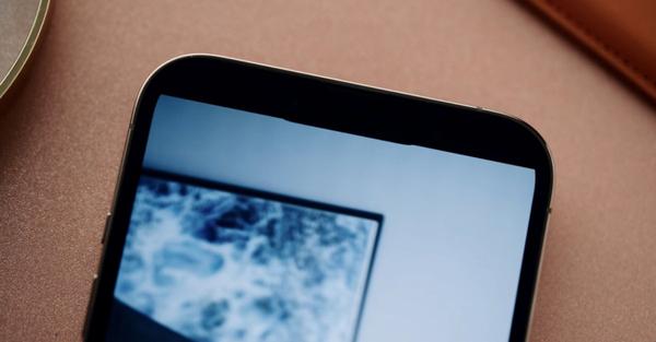
The first reviews of iPhones 13 have already appeared on the web, and one of the Reddit users noticed something that no reviewer known to me noticed. When watching videos with an aspect ratio of 18: 9, notch overlaps the video.

This is what it looks like up close.
Yes, you see that right. The physical notch on the iPhone 13 falls on a fraction of a millimeter on the video. This cannot be a deliberate procedure because the indentation is minimal. I suspect the testers just didn't notice it. But I'm sure that if a user sees this indent once, they will see it forever.
For comparison, see what the 18: 9 video looks like on all previous iPhones with a note. The 18: 9 format fits perfectly in front of the note. The video viewed without the magnification of the frame is adjusted so that it is not cut off on any of the edges.
Why is the 18: 9 aspect ratio important when the 16: 9 video standard has been in force for years? The 18: 9 format (or 2: 1) has become an absolute standard on technological YouTube. It's no secret that most viewers watch content on a smartphone, so the creators have been preparing materials for years to look good on a small screen. A few good years ago, smartphones abandoned the 16: 9 format in favor of elongated proportions, and YouTube followed this move. Today, the standard is the 2: 1 format, precisely due to the fact that it looks great on the world's most popular smartphone, i.e. the iPhone.
In order not to be groundless, I prepared some screenshots showing technological YouTube. Spider's Web TV has long been publishing at 18: 9.
The Verge also uses the same format.
MKBHD also sticks to 18: 9.
18: 9 is also a standard for youtubers from the borderline of the tech and photo world, the best example of which are the films by Peter McKinnon.
The world's largest video platform has developed a way to look the best on the world's most popular smartphone. Now that is changing.
I would wave my hand if this notch inequality applies to Huaweia or Vivo. We have been experiencing it for years on many Android smartphones, each of which once had a notch of a different shape and size.
However, we are talking about Apple. About a company which, after introducing one standard, clings to it for an extremely long time. After all, the unchanged notch was in the X, XS, XS Max, XR, 11, 11 Pro, 11 Pro Max, 12, 12 Mini, 12 Pro and 12 Pro Max models. Suddenly Series 13 breaks with that tradition.
This shows that the days of Jobs and Ive are definitely over. Today, Apple is bigger than ever, but you can see that vision is lacking there. More and more decisions result not from genius, but from the pursuit of the market.
I know it's a first world problem. Many people may not notice it.
At the same time, I believe that when you buy a phone for 5-6 thousand. PLN, it is expected to be refined, and Apple is (was?) a synonym for attention to detail.
Tags: iphone 13iPhone 13 notch

![Apps and games on iOS for free.Promotions, discounts, discounts [27.12.2021] Apps and games on iOS for free.Promotions, discounts, discounts [27.12.2021]](https://website-google-hk.oss-cn-hongkong.aliyuncs.com/article-website/google/2021/12/31/661e1a9d1bdfffaecac65b0350aa0db5.webp?x-oss-process=image/auto-orient,1/quality,q_70/format,jpeg)