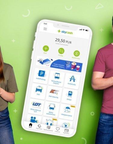
Along with the new version of Skycash, in the section dedicated to motorways, there is an opportunity to add another one - this time a section of the A4 motorway between Krakow and Katowice. In addition, until September 30, 2020, lower fares with Skycash automatic payment will apply. Drivers will pay PLN 3 less at each of the two toll plazas when driving a vehicle of category 1, 2 and 3, and in the case of vehicles of category 4 and 5, the difference is as much as PLN 5. Activation of the service takes place as in the case of the A1 section. Just go to the Motorways tab, add or edit a vehicle and select the appropriate option. After completing all the data (vehicle name, registration number, make and model) and connecting the means of payment, you can start your journey. At the A4 gates, choose the ones marked with a camera symbol on a yellow background - this will allow you to pass quickly without having to stop. This should make it easier to travel and drive through tollgates in the hottest summer season.
This will interest you Private and company mBank account without leaving home now availableXiaomi will be 5x faster than the iPhone in this aspectSkyCash makes it easier to travel on the A4 motorway on the Kraków - Katowice section
The refreshed SkyCash application is a tribute towards young users expecting modern solutions. The new SkyCash is also intended to encourage those who have used the competition's offer so far and are looking for something innovative and definitely better. The changes in the screenshots presented in Weronika's text looked really cool. The previous SkyCash was depressingly ugly and not very functional. And since it is what I use most often (although only for buying public transport and PKP tickets), I couldn't wait to refresh. It's a pity that instead of a smile, a look of disgust appeared on my face.

I use SkyCash on my iPhone. The app in the App Store was last updated three months ago. It didn't offer much, just changes to the way the code scanner worked in the insurance service. The downloaded application is only a "gateway" to something that resembles a specially prepared website with all the functions available in the application. This allows developers to develop their product regardless of the platform it was made available on - and personally I think that's a big mistake. It can already be seen that the refreshed look of SkyCash is at most powdering the old look and adding new, colorful icons on the home page. The fact must be admitted that it looks attractive, but it is enough to enter any of the available sections to quickly see that nothing has changed. The most popular tools - buying tickets for public transport, PKP Intercity, regional railways, buses look the same as before. They're just hidden under a pretty picture.
Read on belowWorst of all though is how slow SkyCash is currently. Launching the application requires at least 10 seconds of loading its "interface". Maybe it's the fault of the increased interest and a large part of users, but if we want to buy a ticket quickly, for example for a bus, subway or tram, no one wants to wait several dozen seconds before the purchase is made - certainly it will not be of interest to the controller who will be happy to write a fine for not having a ticket. It doesn't matter which home screen icon you choose - all available features must load. Even the buttons placed on the bottom bar to facilitate access to some SkyCash functions activate the loading bar and you have to wait.
The creators already explained on the occasion of the presented changes that this is just the beginning of the revolution that is getting ready in SkyCash. I honestly admit that I would rather wait for the comprehensive implementation of the new system and appearance. Perhaps then I wouldn't be looking for an alternative to such a badly working application.


![Apps and games on iOS for free.Promotions, discounts, discounts [27.12.2021] Apps and games on iOS for free.Promotions, discounts, discounts [27.12.2021]](https://website-google-hk.oss-cn-hongkong.aliyuncs.com/article-website/google/2021/12/31/661e1a9d1bdfffaecac65b0350aa0db5.webp?x-oss-process=image/auto-orient,1/quality,q_70/format,jpeg)